Setting up artwork files
Setting up artwork files properly for print can save you time and money. Discuss with your printer the artwork file considerations before you start your project.
Trim sizes that don’t optimise press sheets
A trim size fails to optimise a press sheet when it does not divide evenly into standard industry paper sizes, resulting in excessive paper waste, higher material costs, and wasted production time.
Instead of choosing a trim size first and forcing it onto a sheet, designers should consult with their printer to find the most cost-effective and efficient size and fit for your job. Issues to consider include:
- The type of item you are printing and the type of material being used. Considering alternative material options that come in specific sizes may be more economical to your unique project. Whether it is a book, flyer, brochure, carton, sticker or signage, your printer can advise you on the best way to approach the artwork setup on your choice of material.
- The dimensions you are considering. The page size of your artwork may either make the most of your press sheet or cause waste of material from awkward fitting. Below are example scenarios:
For brochures, using international standard page sizes can at times result in less material waste compared to US page sizes.
For packaging, a reduction of a few millimetres from a carton height could allow for an extra carton to fit on the sheet.
Or fitting your artwork onto an existing die-line, will save you the set-up costs of a new knife. - The quantity you plan to print. Different print methods generate varying costs depending on the amount you want printed. Discuss with your printer to understand the economies of scale and expected make-ready setup to find out what option fits your budget. Get the most out of your materials and print run after consulting with your printer.
Page counts that create inefficiencies
During production, multiple pages are printed onto large sheets of paper, which are then folded and cut. Depending on the print process chosen, standard 4, 8, 16, or 32 pages will make the most efficient use of materials. Page counts that are not multiples of these numbers, can cause issues that lead to production inefficiencies and higher costs.
The following example outlines some considerations for a 14 page document that is to be saddle stitched.
- The page count falls short of 16 pages, so requires 2 pages to be added, resulting in additional paper and/or ink costs as well as increased shipping weight.
- The page count spills over 12 pages, so requires the design to be reduced by 2 pages, resulting in additional redesign costs.
Planning the page count well in accordance to the printing method and bindery specifications, will help you avoid additional costs and production inefficiencies on the press.
Artwork specs that look fine on screen but don’t translate on the press
Below are a few examples:
Document colour settings and colour swatches
Some colours often appear vibrant on digital screens but do not appear the same when printed in ink on paper. Your printer can advise you on the correct document colour mode to use as well as help you choose the best colour match to use in your artwork to avoid colour mismatch and costly reprints.
If you have a mixture of CMYK black, 100% black and RGB black in your artwork, they will all look the same on screen, but will print out differently.
Type of stitching affects the design of the artwork
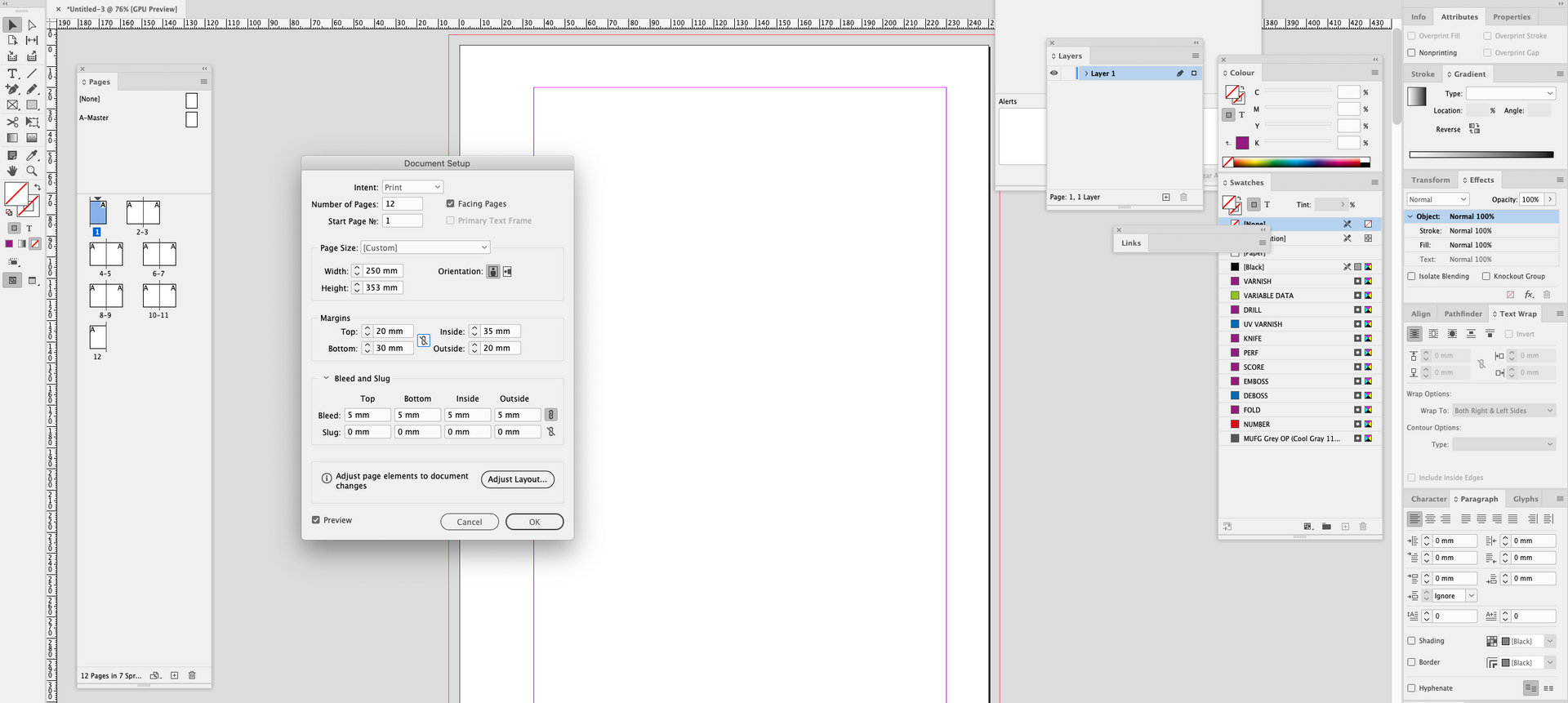
When scrolling through artwork on screen, we may not notice the margin settings in our design. Artwork needs to have sufficient margins and creep to ensure design elements don't sit too close to the page edge or spine and gets truncated.
Overprinting of design elements
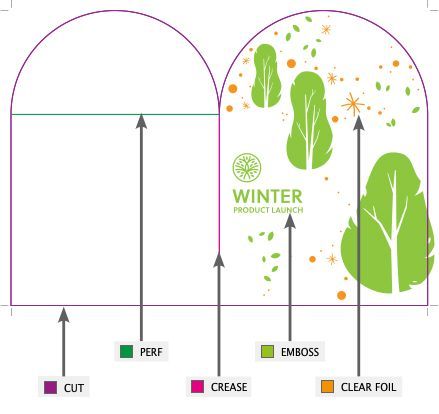
Page elements need to have overprinting turned on in areas that shouldn't knock out artwork. This applies to knife lines, and finishings like foiling and varnishes. Printers can advise designers on how to set these up correctly so the file will separated properly for print.
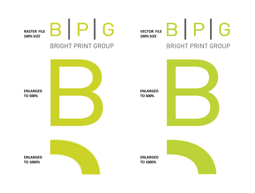
Resolution of images
Images can look fine on screen but appear blurry or pixellated when printed if the resolution is low. Consult your printer to check if your images are suitable for printing.