Using the Correct Colours – Black vs Rich Black

We often use two types of black when designing artwork. Standard 100% black and ‘rich black’. When we use rich black, a percentage of cyan, magenta and/or yellow ink is mixed with the black. The additional saturation of colour creates a rich black that will print darker than black ink alone. 


It is very important to use the correct ‘black’ when designing. ‘Black’ colour swatches can appear to look the same on screen. However, setting up and using the wrong type of black can result in artwork printing incorrectly.


The following examples present some common design scenarios and solutions for dealing with colour issues involving black.


EXAMPLE 1: Black Backgrounds and Images

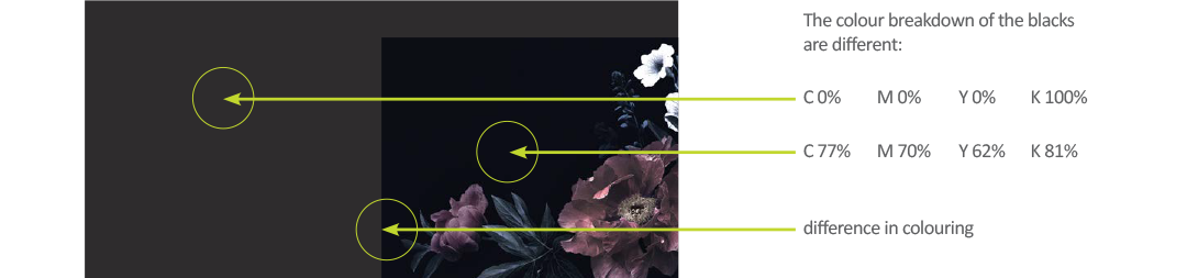
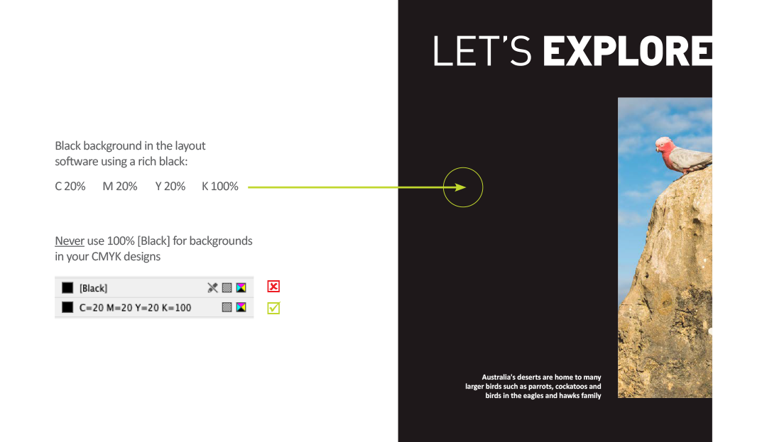
Let’s start with a 100% [Black] solid background and place a CMYK image containing a ‘black’ background on top of the background.


When the design is exported for print, the edges where the image meets the background will not blend together. A clear line of colour difference will show up on the final file.


SETTING UP A RICH BLACK IN YOUR LAYOUT PROGRAM

Big areas of 100% black ink will print very dull. When printing in CMYK, we should use a rich black for better results. At Bright Print Group, we suggest a CMYK breakdown of:  C 20%  M 20%  Y 20%  K 100%.

It is useful to create a rich black swatch within your design file with these values to ensure consistency in your design.


BLACK BACKGROUNDS IN RASTER IMAGE FILES

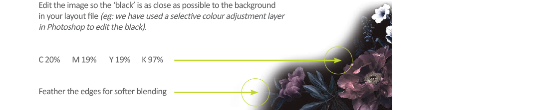
When we use pictures with ‘black’ backgrounds, the colour breakdown is often a mix of cyan, magenta, yellow and black. Without a doubt, every image will have varying colour breakdowns. Before placing an image into your layout, edit the image file so the 'black' has closer color values to the rich black background it will be placed on.


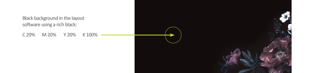
With an understanding of what a rich black is, the below solution demonstrates how the problem in our example can be fixed.


When the image is placed on top, the black background of the image will blend smoothly with the black background of the layout file.


EXAMPLE 2: Designing with Black

This CMYK artwork layout contains a large area of black. This ‘black’ area should be set to a rich black for optimum print result.


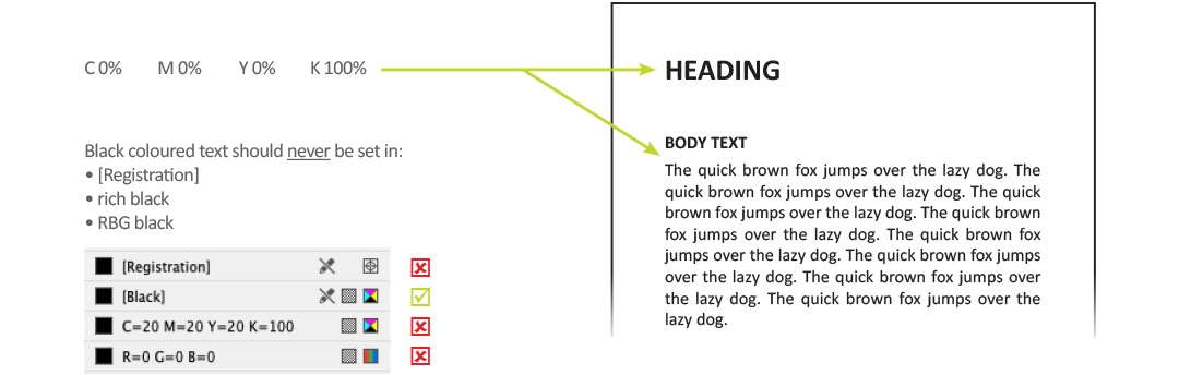
EXAMPLE 3: Black Text

When typesetting in black text, the colour used should be 100% [Black].


If you have any questions concerning the blacks used in your artwork, contact Bright Print Group and our prepress department can check your colour set-up before it goes to print with us!

December 13, 2025
Setting up layers, spot colours and overprinting in artwork. 
November 1, 2025
Distinguishing between raster and vector formats is important for print because they are different in how they store information and form the visual that is your digital graphic. 
two tear-drop style flags on the left and 2 pull-up banners on the right advertising bright print
September 13, 2025
Portable banners and flags are the perfect display tool for marketing at exhibitions, conferences, trade shows, product launches and shop fronts. They are used to grab attention, drive traffic, and promote businesses or events by leveraging their high visibility and cost-effectiveness as a marketing tool. In addition, they can be placed indoors and outdoors.
Person looking at a machine.
September 10, 2025
Learn how printing companies in Sydney empower businesses to boost brand visibility through high-quality print marketing. Visit the Bright Print Group website.
August 11, 2025
Kitting is available for your promotional items! Select from our comprehensive range of products and branding options to create your own custom printed merchandise set. Using our efficient kitting and distribution services , we ensure promotional items are accurately and securely packed and arrive at their destination on time - leaving you to focus on your business.
July 6, 2025
The monochrome design revival is currently trending. Once viewed as limiting in design and outdated, monochromatic designs can be seen popping up in recent popular branding with a fresh perspective. As a counter-trend to recent maximalist design and visual overload, monochrome design is driven by a desire for simplicity and elegance. It's now seen as a versatile and timeless style that can be adapted for various purposes and modern aesthetics. 
warehouse racking system with labels and signage
June 22, 2025
Printing Warehouse Labels & Signs: A well-planned labelling and signage system for your storage environment is essential in ensuring accuracy and efficiency, helping you reduce errors and streamline operations within your warehouse.
June 11, 2025
The Western Sydney Corporate Charity Lunch 2025 was held on 28th May 2025 at the Workers Lifestyle Club in Blacktown. Honourable guests, valued sponsors and some of Western Sydney’s most influential business and community leaders attended in support of the three beneficiary organisations...
June 6, 2025
On 5th June 2025, Bright Print Group held our 9th Biggest Morning Tea at our Sydney office, raising $1029 for the Cancer Council!
Large inkjet printer working in multicolour CMYK on vinyl banner | Digital Printing | Sydney
June 3, 2025
Need digital printing in Sydney? Bright Print delivers speed, precision, & service. Call now to experience the difference!